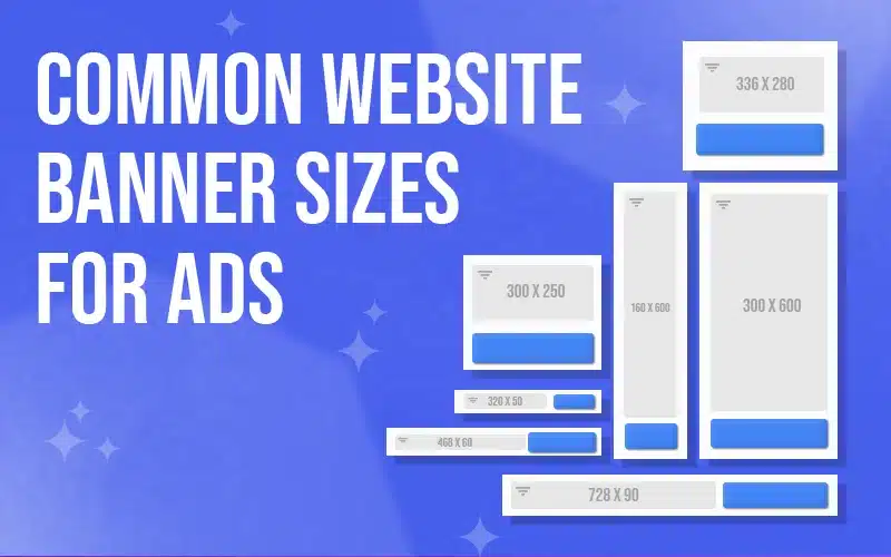
In the world of digital advertising, choosing the right banner ad size can significantly impact the success of your campaigns. With so many options available, it’s essential to understand the different dimensions, placements, and use cases of each ad size. This guide will cover the most popular web banner ad sizes in 2024, breaking down their ideal placements and applications. Whether you’re a website owner looking to optimize ad placement or an advertiser aiming for maximum engagement, this article will help you make informed decisions on banner ad sizing.
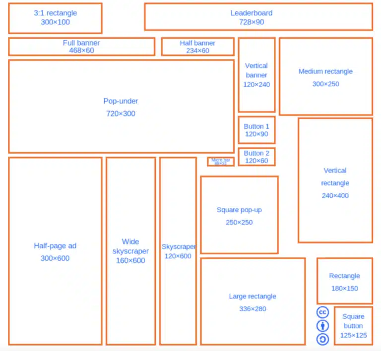
1. Medium Rectangle (300 x 250): The Versatile Choice
The 300 x 250 pixel ad size, also known as the Medium Rectangle, is one of the most popular ad sizes on the web. Its square shape makes it a versatile option that works well within content sections or sidebars. This size is popular because it balances visibility with a non-intrusive appearance, making it ideal for blending with content. Advertisers also favor this size as it offers ample space for graphics, text, and a clear call-to-action. Due to its flexibility, the Medium Rectangle is often used on both desktop and mobile layouts, ensuring high engagement rates across devices.
2. Leaderboard (728 x 90): The Eye-Catcher at the Top
The Leaderboard, with dimensions of 728 x 90 pixels, is a horizontal ad that is typically placed at the top of a web page. This positioning allows it to catch the visitor’s attention right as the page loads. The Leaderboard size is particularly effective on desktop sites, where it can span the width of the page for maximum visibility. Ideal for displaying brand logos, short messages, or call-to-action buttons, this ad size works well for increasing brand recognition and drawing users’ attention from the get-go.
3. Large Rectangle (336 x 280): Ideal for Visual Content
The Large Rectangle, sized at 336 x 280 pixels, offers more space than the Medium Rectangle, making it suitable for ads with detailed visuals or longer text. Its slightly larger size makes it eye-catching without overwhelming the page layout. It’s a great choice for content-heavy websites where it can be placed within or near article sections. The Large Rectangle works well for advertisers looking to create visually engaging ads, and its versatile placement options make it an attractive choice for both desktop and mobile layouts.
4. Skyscraper (160 x 600): A Tall Option for Sidebars
The Skyscraper, with dimensions of 160 x 600 pixels, is a vertical banner ad that’s typically placed in sidebars. Its tall, narrow shape makes it an excellent choice for displaying long, visually striking ads that follow users as they scroll down the page. The Skyscraper format works best on desktop layouts, where sidebars are more prominent, and is especially effective for brands that want to maintain visibility without taking up too much horizontal space. This size is often used for ads with minimal text and eye-catching graphics to maximize engagement.
5. Mobile Leaderboard (320 x 50): Optimized for Small Screens
For mobile users, the Mobile Leaderboard (320 x 50 pixels) is a popular choice. This ad size is optimized for smaller screens, making it ideal for mobile-friendly websites. Placed at the top or bottom of a mobile page, the Mobile Leaderboard provides high visibility without disrupting the user experience. Advertisers can use this size to reach on-the-go users with concise, impactful messages that don’t interfere with browsing.
6. Other Common Sizes
In addition to the most widely-used sizes, there are several other banner ad dimensions that serve specific purposes:
- Square (250 x 250): A compact option that can fit in various areas of the page, including within content or sidebars.
- Small Square (200 x 200): A smaller variation of the Square ad, useful for spaces with limited room.
- Banner (468 x 60): A classic horizontal banner, often placed within content to subtly capture attention.
- Large Leaderboard (970 x 90): A wider variation of the Leaderboard, providing even more visual impact at the top of a page.

Optimizing Website Layout for Banner Ads
To make the most of banner ads, it’s essential to optimize your website layout to accommodate these different sizes. By strategically placing ads in high-visibility areas, you can increase user engagement without compromising the user experience. When deciding on ad placement, consider the flow of your content and the natural eye movement of your audience. For example, Leaderboards and Large Leaderboards work well at the top of the page, while Medium Rectangles and Squares are effective within content sections or sidebars.
Tips for Advertisers: Making the Most of Banner Ad Sizes
Advertisers can enhance engagement by designing ads that fit the specific dimensions and placements of each banner size. For example, use bold visuals and minimal text for smaller ads like the Mobile Leaderboard, while utilizing larger spaces like the Large Rectangle for detailed imagery and longer messages. By tailoring your design to each banner size, you can capture the viewer’s attention more effectively and boost the return on investment (ROI) of your ad campaigns.
Conclusion: Choosing the Right Banner Ad Sizes for Success
Understanding the various web banner ad sizes and their ideal placements is essential for both website owners and advertisers looking to maximize engagement and ROI. Whether you’re aiming to capture attention with a Leaderboard, add subtle visibility with a Medium Rectangle, or reach mobile users with a Mobile Leaderboard, selecting the right ad sizes can make a big difference. By aligning ad dimensions with your website layout and advertising goals, you can create a cohesive and effective digital marketing strategy that enhances the user experience while delivering tangible results.
How useful was this post?
Click on a star to rate it!
Average rating 5 / 5. Vote count: 1
No votes so far! Be the first to rate this post.
Author
-

Meet Anthony Ernst, the creative force behind ThreeSphere. With a passion for art and a knack for business, Anthony is a multi-talented entrepreneur who wears many hats. As the owner of ThreeSphere, he combines his expertise in web development with his artistic vision to craft stunning and functional websites for clients.
View all posts

